The Psychology Of Colors In Marketing
by Brad Hines 6-12-13 11: 49 am
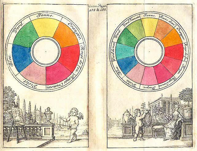
The psychology of how people perceive different colors is something that has proven scientific evidence behind it. It is  two-part: one is the immutable physics aspect to it, for example certain colors will reach your eyes first like red and yellow. Also, certain colors will be dissonant and vibrate next to each other like green and red. The second bit of science behind color perception, is simply how through inculcation, the more we see colors in a certain context, the more powerfully we associate them with something. This aspect of color perception changes over time. Look at the color pink and think about femininity for example, and consider whether you believe the color to be innately "feminine", or in fact, heteronormatively so through a cultural portrayal of it.
In visual marketing campaigns, color is literally the first thing that people notice, well before processing the copy, and certainly before—but definitely contributing to—how they will feel about the product. This is perhaps a mixed metaphor, but first and foremost, the color in your campaigns will set the tone. Color creates the "feel" for your campaign on a subconscious level before our conscious mind has even decided we know what that is, because of how the brain processes it. The feel I speak of can be anything from the appetite stimulation of reds and yellows, to how "cool" colors like blue and greens tend to relax people. This is why color should be at the forefront of your branding considerations.
 We change color schemes and backgrounds often. It's all about drawing the customer into our book so they browse longer and buy. We change color schemes and backgrounds often. It's all about drawing the customer into our book so they browse longer and buy. |
Shelley Stephens, Marketing Specialist, University of South Alabama Center for Continuing Education says on color: "Softer colors are just as powerful in conveying characteristics. If we want to market a product that will establish the trust of our customer that our product will clean, we use white. If we want to play on our customer's emotions in associating our product with babies, we use pastel colors; because when we think of babies we think of them as soft..."
Aaron Cook of d50 media adds: " As a marketer and designer, significant attention is given to color with each website build, as well as working with clients on re-branding projects. Just as words or ‘copy’ explain what a company or product does, color complements and even enhances the overall messaging, while also being powerful enough to evoke a certain thought or reaction.”
One thing that marketers and design people alike can do is play with colors in a vacuum as best that they can, and see how it changes results, all things being equal. Those results might be visits in your Google analytics, and certainly sales, and many metrics you can use in between. An example of one metric, Pinterest revealed recently that red and yellow pins get the most shares. By the way, notice the colors of the links and pull quote in this article.
Kyra Mancine of QCI Direct says, "Our graphic designers are always experimenting with different colors and their impact on sales. We change color schemes and backgrounds often. It's all about drawing the customer into our book so they browse longer and buy." Mancine also added about the aforementioned concept of putting your business' calls-to-action in colors that arrest the readers attention.
Please keep, use, and share the handy color consulting guide below for all your marketing campaigns.

Shop to help support our content habit: Full disclosure, you may find these products awesome.
